

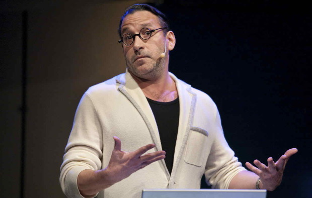
Chip Kidd
Chip Kidd is a contemporary American graphic designer, author, and editor. Born on 12 September 1964, in Pennsylvania, He grew up to be an associate art director at the New York publishing house, Knopf. He was hired at the publishing house as a junior assistant in 1986. He also freelanced for various firms and produced more than 70 book jackets per year.
The leading American literary news magazine, Publishers Weekly commented on Kidd’s book jackets as being creepy, unconventional, cunning and striking. They are designed in a manner that makes the book readers appreciate the covers as a separate art form and as well as part of literature.
I particularly appreciate his approach to his own designs. From his biography on Famousgraphicdesigner.com. From the article: ‘Despite Kidd’s rigorous and meticulous work on his designs, he often downplayed the significance of his covers. He doesn’t advocate the idea that the book-cover alone can sell the book. Instead, he believes that the content of the book holds the key to its success and cover design plays a minor role in it.’
Each of his designs is a masterpiece in its own right, unique yet bearing the unmistakable mark of his style. Here is a selection of my favorites, each serving as a source of inspiration for my own work.


Here are a series of my favorite covers created by Chip Kidd. I chose these covers because they are striking and eye-catching. They do not all give a clear sense of the book’s content, at least at first glance. However, they are each works of art in their own right, and each creates a tantalizing first impression that sets the mind to consider what the book may contain.
I was particularly taken with the two examples which play with the immediately recognizable Time Magazine cover design . Despite using the same source material, both covers are unique in their approach to reworking the original design. They remind me of a recent project of my own, where I juxtaposed Social Media controversies with the style of various print magazines, which you can find here.
Further Inspiration
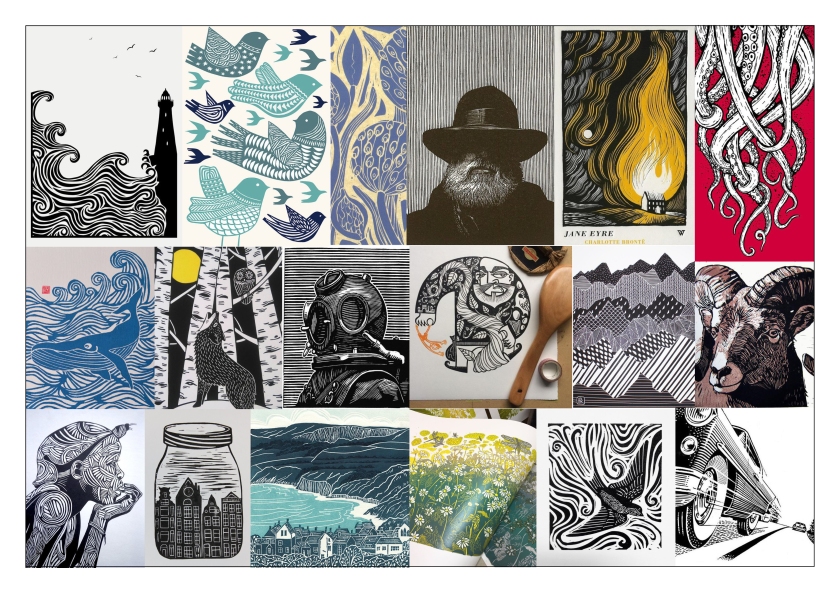
Above is a collection of prints which demonstrate the wide variety of style and outcomes which can be produced using Lino. The skill ceiling for Lino is, clearly, incredibly high. Even simple designs, however, such a the jar in the bottom left corner but one, has a depth and character, almost because of its simplicity. Lino is one of the media which forgives untidiness, and can sometimes be enhanced by it.
In recent months, I have worked closely with a number of peers from my course. During that time I have seen a huge number of techniques, and approaches to design which have enthralled me. In particular, Lino printing is something I have not attempted since secondary school. However, after seeing the vivid, thick lines and stark contrast that lino can create, I was determined to give it another go.
Initial Sketches


As I have outlined in previous posts, my outcome is intended to encompass expert opinion and my own anecdotal experience of ADHD. This aim behind this is to demonstrate how clinical definition can apply to real-life scenarios. By explaining how an overarching system of symptom-based diagnosis can play out, I want to give people a human sense of the condition, rather than an academic one.
Some information about myself as a person, including perhaps an image, or illustration of myself, maybe valuable in creating a relationship between the reader and the content. If people can be allowed to consider you a person, in a real sense, rather than a distant stranger, they will be more receptive to your words.


Illustration will play a key role in my project, and as such, I aim to create artworks to express visually, the experience as described in writing. I am a very visual thinker, and I think that is common among people with ADHD. If I need to plan a route in my head, I travel the journey in my mind, visually following roads and paths. Chances are, I couldn’t name a single street name on the chosen route, because that information goes in one side, and out the other. It will not stick. When asked, I reference landmarks and previous trips to the relevant area.
As is always the case when creating a product for an audience, the nature of that audience, their preferences, attention span, age demographic, etc can inform your decision and allow you to tailor your outcome to best suit the audience you see as interacting with it. Fortunately, my audience is much like me. ADHD is not an age-related condition, it is a hereditary condition which, while its impacts on life may grow and wane, never ceases to be a part of your life.
Lino Cuts


Here are my first lino two prints. Both are somewhat scuffed due to the paper I printed on getting partially stuck to the lino. The first (right) image will be connected to a section exploring a tendency towards poor emotional recognition and management, and sudden spikes of anger caused by overstimulation.
I have experienced this myself, plenty of times. Stress due to things at the back of your mind can build without your conscious awareness, and then some small trigger, like somebody repeatedly misunderstanding what you are saying, can cause a wave of anger, that seems to come out of nowhere. The energy it takes to refrain from shouting can be enormous.
The second image (left) describes the experience of disassociation. This is a very common occurrence in my experience and can be one of the most disruptive aspects of the condition. A personal example would be in meetings or lectures. I can be even being spoken to directly, and I will not, agree and appear fully focused, even to myself, before they suddenly finish speaking and realize, I haven’t taken in a single word.
Test Prints


Initial prints had mixed success. Being a complete novice in the use of Lino, and with only a cheap starter kit to help me, the best I could say is that I have learned what not to do, The left print is on high GSM watercolor paper. The textured nature of that paper stock has drastically reduced the clarity of the print, which in this case is detrimental, as the print is highly detailed. However, for other purposes, such as creating texture behind the text, or in creating a static TV effect, it could offer its own advantages.


Further experimentation will be necessary on Monday, when I will have access to the University’s print studio, and hopefully, the expertise to get some high-quality prints made. Until then, I will work on carving more prints and setting my text.
