Visiting Zenith Media

Zenith Media is one of South Wales fastest growing print manufacturers. Ian, our lecturer organized the trip.

Thanks to Zenith’s links to Cardiff Metropolitan University, we were given a full tour of their facilities.

We were first given some background information about the company’s recent past and the reasons for their successes. All of this was extremely educational because as much design work as we, as students have done. There’s nothing like the real world of business.

Here we saw an engraving machine that manufactured plates that would later be inked and used for printing possibly hundreds of thousands of sheets of copy.

Four plates are necessary as a full colour page is composed in the CMYK colour gammit.

The enormous printing machines had open troffs at intervals with rollers evenly spreading each colour across the engraved plates.

As a quick aside. Zenith also does smaller batches of digital print for smaller customers or trial runs. I noticed that their ink cartridges look recyclable. Apparently every effort is made to recycle waste from each stage of the printing process.

Some examples of stacked printing jobs awaiting binding. This included a piece clearly for Cardiff Met.

What amazed me during the tour was the number of components of a print job that could be adjusted with an almost limitless number of combinations of paper weight, paper colour, texture, ink colour and formula (some are mineral based, some vegetable based etc) and extra effects such as embossing, debossing,

In the first image, there is the bossing and debossing machine which is antique, the technology hasn’t changed awfully in the interim so there is no need to replace them.

In the second image there is a job, midway through production. It is some memorial piece with regards to Amy Whinehouse. You can see that certain elements that needed to be exentuated have been given a glossy finish.

During my time at Zenith I learned of the sheer scale of operation required to create beautiful works of print on an industrial scale. The number of professionals with small specialised roles in keeping the whole operation in motion was impressive and quite daunting.

I learned an awful lot about the importance of networking and being willing to put yourself out there and encourage this to proceed to your benefit.

Final Alterations – Steps 4 Pets

App Icon

Image result for change 4 life

Here is my original App Logo. Although I was happy with the overall design language. I realised there was a disconnect between this and the posters I had created. There was also no hint in the app design itself that the project is one under the ‘Change 4 Life’ banner. I have since made some rather large alterations.

App Icon 2

Here is my final design. Along with the posters, it will be the basis of my final submission. As you can see, it holds far more in common with the ‘Change 4 Life’ logo. I have utilized the colour scheme for both the background and the lettering. I have also used the closest approximation to the typeface as I could create. My decision to use capital letters is due to the real size the app icon will eventually be constrained to, namely around a square inch.

Along with my posters, I believe I have created a comprehensive design language to convey my idea which I also believe to be strong.

This slideshow requires JavaScript.

Steps 4 Pets – Developing my Idea

For the first project in my persuasion module I have been tasked with creating a campaign on a topic chosen by myself from a list. I chose to focus on health.

Originally I had hoped to do a campaign focusing on voluntary euthanasia. I explained in a previous blog post, my reasons for initially choosing this topic and for rejecting it after further research. I have now decided to focus on fitness and well-being. I decided to do my work under the banner of Change4Life. A government organisation run through the NHS in order to educate and encourage families to adopt healthier life choices in terms of diet and exercise.

My focus, while on the entire family unit, is specifically primary aged children. My reasoning behind the is that much of a child’s diet and exercise habits and choices are determined by the lifestyle of their parents.

The app concept is one that would allow a child to care for a pet avatar. The avatar would represent a pet that would need walking and caring for. The completion of tasks such as going to the park or taking a certain number of steps a day, would generate rewards which would allow the user to build their avatar in certain ways, such as increasing its abilities and buying unique items for them.

My research has been quite extensive,  this has allowed me to target my audience very closely. My idea is that young children will need supervision to accomplish the tasks set out for them in order to earn rewards and many will need a parent to download the free app. This will encourage all parties to get out and be more active.

Initially I intended to create a tamagochi type device which would be cheaply purchased and allow the child to have control of the avatar entirely independently. But it became clear that this would create a financial barrier to entry for the programme. Of course, a phone is still required, but according to www.statista.com that should be less of an issue.

Capture

Creating the app is one thing. But I had to build an entire design language that would be appropriate for the audience and work in multiple contexts. I elected to use a series of arcade style icon in bright, block colors and to begin by creating a number of posters.


I decided to make my posters as minimalist as possible in order to hold children’s attention. Too much information may be off-putting. Each poster contains an icon of an item that can be earned or collected in the game and each bestows its unique benefits. I wanted to make the experience of this game one of development and positive reinforcement.

This idea is partially inspired by the game Pokemon Go, where a player uses their phone’s GPS and camera to find Pokemon to capture as well as various rewards, in a similar vein to geocaching. This may seem strange as Pokemon go went from a sensation to a distant memory in a matter of months. I believe this is due to its lack of reward for persistence and its lack of variety and development as you play. This Role Playing format is very popular, for example:

  • Club Penguin was a massively multiplayer online game (MMO), involving a virtual world that contained a range of online games and activities. It was created by New Horizon Interactive (now known as Disney Canada Inc.). Players used cartoon penguin-avatars and played in a winter-set virtual world. Club Penguin was made available to the general public on October 24, 2005, and expanded into a large online community, such that by late 2007, it was claimed Club Penguin had over 30 million user accounts.[2] As of July 2013, Club Penguin had over 200 million registered user accounts
  • World of Warcraft (WoW) is a massively multiplayer online role-playing game (MMORPG) released in 2004 by Blizzard Entertainment. With a peak of 12 million subscriptions in October 2010 and Blizzard’s final report of 5.5 million subscriptions in October 2015, World of Warcraft remains the world’s most-subscribed MMORPG, and holds the Guinness World Record for the most popular MMORPG by subscribers. In January 2014, Blizzard announced that more than 100 million accounts had been created over the game’s lifetime.

I believe there are a number of reasons for the success of these games. One was the community network aspect. Players had a huge number of fellows and could play and compete against strangers. There is also the aspect of character development. Both game featured a standard unadorned avatar as the starting character which could be improved and personalised, giving the player a feeling of accomplishment.

I plan for this app to incorporate both of these elements. The avatar will be a dog, a number could be chosen, their names as well as their fur patterns could be chosen by the player. They would then work towards training their pet and purchasing items for it. They would also have other features such as the ability to compare their achievements with other players on local or even national leader boards.  I would also have daily or weekly challenges that would vary from week to week, keeping the game from becoming too repetitive.

I designed this graphic to illustrate my idea.

Iphone mockup

As you can see, the app would be entirely self contained, requiring nothing but a mobile phone. I decided that since the purpose of the app is to encourage healthy life changes, there should be local events page that would allow users to advertise for activities and events. These could be a chat function allowing members to communicate within groups to organise various events.

My Thoughts

I do have my concerns that I am focusing too much on the functionality of the application rather than the design language it would employ. The two are so intertwined and so, what might work on a printed page, may not translate all that well into a an app on a small phone screen.

I will continue to advance and refine this idea as I have found inspiration for additions and features comes faster than I can implement it.

Visual Story Telling Brief

We have been asked to create a narrative through visual story telling on any subject we choose. The idea is to create a visual piece that uses a systematic approach to convey statistics or other forms of information.

There are numerous forms of visual information we use on a daily basis without even taking conscious notice of them.

Isotypes

  • Street SignsImage result for uk street signs

The world is full of street signs, many countries have their own approach to these signs, but all of them follow a theme. They all revolve around the use of isotype.  Isotype is a means of communicating simple messages in a visual form that is more universally recognized than text. Visual representations of the message are created to quickly bring to mind the subject matter and allow those who see the symbol to react accordingly.
One reason Isotype is used so universally in road networks is to allow people internationally to comprehend their meaning.without having to understand the language. While many signs include some text, they are designed to be comprehensible regardless of this.

Hieroglyphics 

The term hieroglyphics refers to a system of writing using ancient Egyptian symbols. The hieroglyphics involved a series of ‘picture’ words. Consisting of several hundred words, this system of writing was intensely complex and very labor intensive. The first hieroglyphics were used on buildings and tombs. It is believed that the Egyptians first began developing this system of writing about 3000 BC.

http://www.ancient-egypt-online.com/ancient-egyptian-hieroglyphics.html

Similar to istype, hieroglyphs were ancient examples of using pictures as language. They would represent actions or events and tell a story in a linear fashion.

Wingdings

Wingdings is somewhat of a phenomenon as it is a commonly available typeface that consists of seemingly random symbols in place of alphabetical letters.

‘In the early ’90s, it was one of the first times people realized fonts could break through to the mainstream. One of the creators of Wingdings, Charles Bigelow, of the legendary design studio Bigelow & Holmes, told me Wingdings marked one of the first times a font became part of the popular culture.’

‘As a means of writing sentences, Wingdings fails — but that was never its purpose. It was created to be used as a unique tool for the pre-internet era. It was akin to emojis, but with even more utility.’

‘Today it’s easy to cut and paste images from the internet, but it used to be a lot harder. There were few ways to get images, files were way too large for puny hard drives, and they were of poor quality. Even worse, it was tough to get pictures to play nicely with text. Fonts like Wingdings provided a workaround by giving people high-quality, scalable images that didn’t clog up their hard drives.’

https://www.vox.com/2015/8/25/9200801/wingdings-font-history

Wingdings then, is not much good for story telling of any kind. Unless, it seems, you are a conspiracy theorist. In my research I found an odd story regarding Wingdings and the events in New York on September 11th, 2001 or 9/11.

According to some, the Wingdings font predicted the events of that day. This theory comes from the fact that if you type Q33NY in Wingdings it will turn them into images that seem to relate to the events. It’s clear to me that this is very dubious. But the story seems to have gripped many people and as far as stories telling goes, this story made a large impact on people.

https://gizmodo.com/wingdings-predicted-9-11-a-truthers-tale-1679759324


Pet Portraits

This blog is primarily a tool to enable me to record my learning process as I progress through my university course. One aspect of that, for me. Has been to take on design work outside of work parameters in order to improve my skills. 

Over the past months I have been working to build a pet portraiture business in order to help pay my way while I study. Although it does not strictly come udner the rubric of Graphic Design, it has always been a hobby.

Illustration has allowed me to visualise work before attempting to recreate it digitally. I’ve never posted about my portraiture work before. But I feel it is relevant to my practice, so why not? 

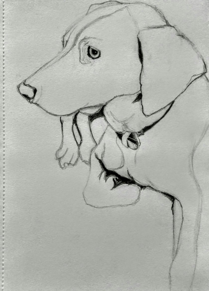
I was commissioned to draw a Weimeraner called ‘Blue Bell’ as a Christmas gift for a client. I was given free reign to select my favourite image from a great number. 

Bkue Bell the Weimaraner

This was my favourite image. I like to capture dogs looking composed and relaxed. I also was happy with the lighting, it is natural and comes from one distinct source. 

Stage On

I always work entirely free-hand, I find that although it is never truly faithful tot he image, I manage to capture the likeness of the subject and add my own twist. Who wants a photorealistic portrait agent hey already have the photo? 

Stage Two

Once the basic shape is refined to my liking I begin to add the darkest shadows first. 

Stage Three

I begin building layers of shade and texture into the picture, I do patches alla cross the body instead of completing it section by section to ensure I don’t have disparity in contrast or  shading. 

Stage Four

I continue to add further detail,each breed is different, some longer rhaired dogs require a lot of detailing in the fur as it has irregularities. But Blue Bell is beige and short haired which made things easier. 

Finished Piece

Each portrait takes several hours, start to finish, but I always enjoy the process. I think people interpret so much expression is dogs faces, so capturing that is very important. 

Making my Mark

In our recent brief to create 100 marks or logos to represent our unique design practice, I learnt a great deal about what works and what doesn’t.

 Our pieces were awarded points by other students who each had six stickers to award. Three blue for professional execution and three orange for creativity and communication. There are more details of this in a previous post of mine. 

I had three or four designs of my 100 which received some awards, which I was very surprised by. If these I chose my personal favourite and decided to further refine the idea, refinement not being an option during the brief owing to the shear volume of work demanded. 

#85 The Wave

This piece was a personal favourite of mine so I’m glad someone shared my feeling. I’ve since done some sketching to advance this design and I’ve explored numerous variations. 

As you can see from the image, I was still open to any kind of alterations. The only consistent theme is clear geometry and a wave as the central theme. I feel that this is personal to me because I have always lived costally and been an avid surfer and lover of water sports of all kinds. 

I have two main lines of design going forward. They are marked in each stage by a letter for the design avenue and a number for the stage of design. 

‘A’ Series

The ‘A’ series follows most closely to the original sketch in the 100 marks project. I wanted a wave which emerges seemlessly from the circle in which is sits, that comes to a sharply defined point in the centre. 

Using a series of handdrawn geometric shapes, I aimed to give the mark the cleanest finish I could. I also settled on clean, clearly defined lines throughout with no texturing or complexity to allow the image to be shrunk and still be recognisable. 

‘B’ Series

Both series were designed in tandem and simply labelled afterwards to define them. With the ‘B’ series I was aiming to experiment with the use of negative space. Clean and simple is great, but a wave is just a wave. There are numerous brands which already feature this and I was worried I’d become one among many. 

I decided to create a logo with two waves opposite and the reverse one another, within a geometric shape which would be filled and leave the waves outstanding in negative space. This had the added benefit of creating an interesting shape in the centre that at first glance seems random until you realise it is a set of waves. 

Trying to make this logo implicitly oceanic rather than simple and explicit was a goal of mine. I wanted it to have depth and character. I think this design did a fairly good job at that and so I’m planning on moving to the next step and digitising it in Adobe Illustrator. 

Here are my two most advanced designs to date. Each is handdrawn to a greater degree or accuracy and detail. I will likely also digitise the ‘A’ series design at a later date. 

Designing with Adobe Illustrator

In our meetings, our group decided that we’d split the animating workload evenly with each of us doing approximately 15 seconds each. I asked to do the introductory 15 seconds. To do this I had only Laura’s character which she had made in preparation. We would all need the model to insure our work would be uniform.

Emily Frontback of Emily

Here is the model of Emily that Laura designed in Illustrator through consultation with the group. We each had a copy of the project to use when we animated independently. We aimed for a sensible character with a large expressive face and features that would suggest her to be a young teenager. She needed to be taken seriously but be young and represent the most vulnerable users of the internet in society. Old enough to be active online, but young and naive of the risks.

shitty desk space
#1 Bedroom 

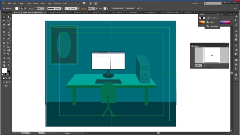
Here was a quick mock up of the room Emily would be occupying. It’s quite obvious that I’m less than stellar at using Adobe Illustrator but it was useful to have everyone on the same page about the rough design.

With Laura’s help we adjusted and refined the design and improved the colour scheme.

desk space
#2 Bedroom 

This was a far neater and more sorted model using the bones of the original. The colour scheme is far cleaner and makes Emily the center of attention with her bright red heavily contrasted against the blue/green surroundings.

Emily at Desk
Emily at the desk

It took far longer than I’d like to admit to seat Emily at the desk. The layer system is the same as Adobe Photoshop. However the controls are vastly different and more complex. We also had issues of page dimensions. As you can see the original sat within the green box. I had to change the canvas size and widen the background to compensate for this.


Here is my first frame in its completed form. The minimal movement was a symptom of my lack of ability with Adobe After Effects. This will be less obvious as I progress through the project. I wasn’t able to hear audio in the After Effects preview, so, thinking on my feet, I downloading VideoPad Video Editor and inserted my rendered footage to add the audio. I will attempt to recreate it in my own time at a later date. I have had several big ideas that were too late coming to be used and I’d love to try to animate them.

Emojis

The emojis were tricky to design, but I felt they were really important. They are copies of the official Facebook angry face emojis which was very intentional. Facebook has spent huge resources on developing a brand which makes them and their designs immediately recognisable to most. In particular, millennials. In using this method, huge amounts of the work of conveying a message visually has been done for me.

Animating with Adobe FX

In a recent tutorial we were given our first instruction on using Adobe FX (After Effects). This was to prepare us for our animation project in which we would create a 45-60 second short video. Until this point I had felt confident that it would be a relatively simple endeavor.

Here’s the video. It was a joy to build this piece for scratch. Although the work requires infuriating levels of precision to avoid catastrophic errors, it is deeply satisfying to slowly build up a video and call it my own work. The layering system is in principle, the same as in Photoshop and Illustrator which is very helpful.

This was my first experience animating anything at all. But knowing the complexity of the process, building endless layers and having to watch the same couple of seconds of footage over and over to ensure it all plays in harmony and no one’s limbs fly off, I feel like I have a lot to learn. Adobe FX is vastly more complex than other Software I have used so far and must mean it has far more potential uses.


Cyber Bullying Research

Since changing groups, my topic research up to now is somewhat irrelevant. My new group is working on a piece exploring Cyber Bullying and raising awareness of the issue. To be a productive team player I will need more information about the subject and that’s the point of this post.

Bullying and Cyber Bullying

Bullying is behaviour that hurts someone else – such as name calling, hitting, pushing, spreading rumours, threatening or undermining someone. It can happen anywhere – at school, at home at work or online. It’s usually repeated over a long period of time and can hurt a child both physically and emotionally.

Bullying that happens online, using social networks, games and mobile phones, is often called cyberbullying. A child can feel like there’s no escape because it can happen wherever they are, at any time of day or night.

Bullying is an issue faced by young people and adults alike. But children are often far less autonomous and can feel they have less  control or recourse. A child spends 5 days a week in school, the majority of the people they see are school piers, if they suffer in school then it can feel as though they are trapped.

NSPCC (link)

  • There were over 25,700 Childline counselling sessions with children about bullying last year. (2016)
  • Over half of lesbian, gay and bisexual young people have experienced homophobic bullying at school
  • More than 16,000 young people are absent from school due to bullying
  • There were over 11,000 counselling sessions with young people who talked to Childline about online issues last year

Children aged 11-16 on social media

Researchers conducted an online self-completion survey in December 2012 of 1,024 11-16 year olds in the UK.

  • 28% of children aged 11-16 with a profile on a social networking site had experienced something upsetting on it in the last year
  • Of the children and young people who were upset, 11% were dealing with upsetting experiences on a daily basis
  • The most reported issue experienced on social networking sites was trolling, experienced by 37% of children who had been upset.
  • Other issues experienced by children who had been upset included: pressure to look or act a certain way (14%), cyber stalking (12%), aggressive and violent language (18%), encouragement to hurt themselves (3%), receiving unwanted sexual messages (12%), and requests to send or respond to a sexual message (8%).
  • Over half of 11-16 year olds (58%) believed at least one of the people responsible for the behaviour which had upset or bothered them was either a complete stranger, someone they only knew online, or they did not know who it was at all.
  • Only 22% of the children who were upset talked with someone else face to face about the experience.

What children have said of their experiences with bullying

Published 2016. Bullying has been among the most visited subject by NSPCC callers since 1989.

  • Bullying is the second most common reason for boys and the third most common reason for girls to contact Childline. It makes up 9 per cent of all counselling sessions
  • Bullying is the most common reason for children aged 11 and under to contact Childline; almost 1 in 4 sessions with this age group
  • Physical bullying is the top bullying concern for children aged 11 and under; peer pressure is top for 12–15 year olds and online bullying for 16–18 year olds.
  • Bullying affects academic performance and is linked to mental and physical health problems. 1/4 children is counselling sessions talked about mental health concerns

Article suggesting girls are twice as likely to be cyber bullied than boys. (Survey by ‘What about YOUth’ organiation)  http://www.dailymail.co.uk/health/article-3350981/Why-s-tough-teen-Girls-TWICE-likely-victims-cyber-bullying-nearly-half-think-fat.html

Swansea girl committed suicide after being bullied on Snapchat and Facebook http://www.mirror.co.uk/news/uk-news/heartbroken-mum-14-year-old-9775207

A quarter of teenagers suffered online abuse in the past year. (Article posted 2016) https://www.theguardian.com/uk-news/2016/feb/09/internet-trolling-teenagers-online-abuse-hate-cyberbullying


Group Discussion on Animation Topic

Conceptualising

Our first task in our new animation brief was to each decide on a topic that we felt strongly about. Go away and research said topic, and then bring what we had to a group discussion and pitch it to the group.  Unfortunately, only two of our group of four were able to attend this discussion. Myself and Jenny.

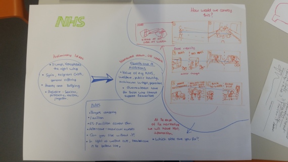
My pitch, which is outlined by my research in a previous blog post, was centred around Healthcare. The system of healthcare we have in place in the UK currently (The NHS), the pressures placed upon it (funding and staff shortages, political opposition etc), and the emphasis on its necessity as an institution.

The exact nature of my topic was still rather broad as I wanted it to be flexible and possibly to incorporate other topics within it, making it as appealing to the group as possible. For example we could look comparatively at healthcare in other countries, healthcare availability and cost , issues surrounding reproductive rights for women, unjustifiable price increases for essential medicines in some countries for personal gain of manufacturers.

2017-03-01-18-45-282017-03-01-18-44-25


Refinement

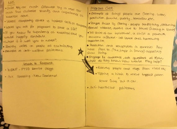
We narrowed our topic pool down to our personal favourites and continued to refine them. Mine remaining the NHS but more focused on the hiking of prices for medicine that have been frequent in the news in recent year and/or the need for compassion in a society. And Jenny’s being the Migrant crisis, possibly centring around the story of a migrant who became a model member of society in becoming a doctor and helping the population that gave him asylum, with a message of general goodness being cyclical.

NHS – Compassion

  • The general idea of this would be to show the direct compassion that seems inherent in humanity,
  • ‘humans are a social species who care for one another, even animals show compassion’
  • Clips of people instinctively helping other and animals:

Just a few potential examples.

  • Caparison between direct and indirect compassion. e.g most people would help someone they saw in danger or in need. But people vote for parties that would strip benefits from those who need them (disability benefits etc) because it saves them some tax money.
  • This would include possible clips of politicians scapegoating vulnerable groups


Pharmaceutical Monopolies

  • Examples:

http://www.dailymail.co.uk/news/article-3246093/Drugs-boss-hiked-price-life-saving-AIDS-treatment-5-000-cent-tried-kidney-pills-vows-reduce-price-refuses-say-much.html

http://www.telegraph.co.uk/business/2016/12/16/drug-maker-overcharged-nhs-hiking-price-hydrocortisone-tablets/

http://www.telegraph.co.uk/business/2016/12/07/drug-firms-fined-90m-hiking-price-nhs-epilepsy-drug-2600pc/

  • Explanation of the impact this has on people, medical bankruptcies etc.
  • NHS is already struggling, this will damage it further


Migrant Crisis/Syrian Doctor

  • Dispel the myths about ‘ taking our jobs’ and ‘living happily off benefits’. Two paradoxical ideas.
  • Illustrate the suffering and pain of asylum seekers from those countries
  • Seek to humanise these people, they are often seen merely as statistics and numbers
  • Use a narrative to show that immigration is not simply a valueless burden on the host nation.


20170227_12115120170227_121136


My Thoughts

Regardless of the outcome of this stage of the process and whichever topic we finally land on as the one to carry on with. I am happy to have had the experience. Proffering my ideas and having other ideas counter them. It has been interesting to learn about topics that my piers hold strong views on and to debate the minutia of each topic and our feelings on the nature of the problems and the most effective solutions.